How to build a storefront theme for btab, and how it compares
A btab theme is a set of colours, fonts and style settings plus a stack of approved blocks. There's no code in it. Here is how you build one, what we check, how it reaches shops, and how that compares with Shopify, WordPress, Webflow, Framer, Wix and Squarespace.
By The BTAB Team
If you've built a Shopify theme or a WordPress theme, you've written template code and then a settings file so shop owners can change colours and fonts. A btab template has the settings file and leaves out the code.
The short version
- A theme is data, not code. It's a set of theme settings (colours, fonts, style dials) plus a recipe: for each page, an ordered list of blocks and their settings.
- You design within a fixed block library. Every btab storefront is drawn by the same code, from the same blocks. Your job is to choose and tune them, not to write HTML, CSS or JavaScript.
- Applying a theme copies it. A shop owner picks your theme and gets their own copy of it, then changes whatever they like.
That's why one theme can serve shops that sell sofas, vinyl records or office chairs, each with its own logo, products and photos.
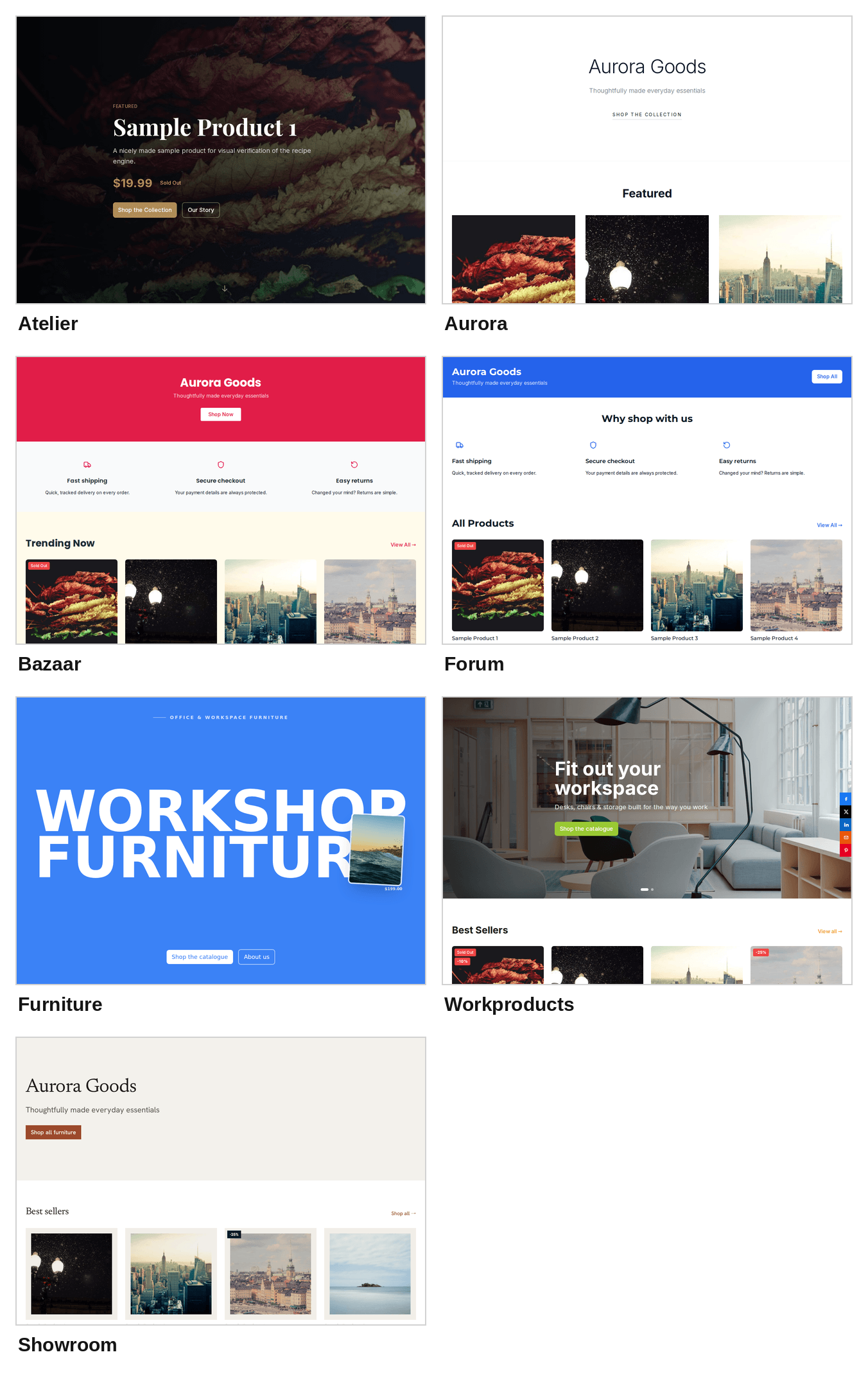
Our gallery has 7 themes, each with its own layout, and 17 colour sets between them: pick a theme, then its colours. Above are all seven, each with the same sample shop and sample products, so the only things that change are the layout and the theme settings.
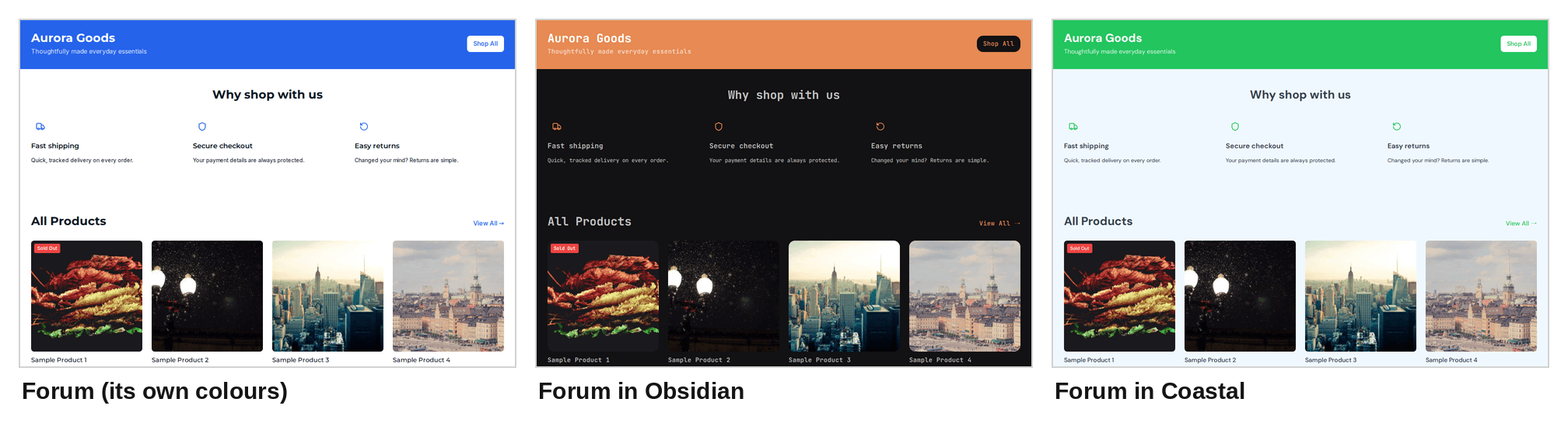
A colour set keeps a theme's layout and changes only its colours and fonts. Here is one theme, Forum, in three of its colour sets:
What a theme is made of
The theme settings. Five brand colours are required: primary, secondary, accent, background and text. Each one has a defined job. For example, primary colours the main buttons, prices and links, and secondary colours the footer. Thirteen optional neutral colours cover cards, panels, borders and secondary text. You need to set all of them for a dark theme, or cards and inputs stay white. Colours are plain hex, with no transparency.
You choose one heading font and one body font from 500 open-source Google font families. We host the fonts ourselves, and there are no italics.
Then there are the style dials. Each one has a short, fixed list of values:
- corner radius: sharp, soft or round;
- spacing density: compact, comfortable or spacious;
- motion: calm, subtle or lively;
- logo size and icon weight;
- header height, whether the header sticks when you scroll, and four header layouts;
- four cart icon styles;
- how photos sit in product cards, on the product page and in category tiles: a square crop, a 4:5 portrait crop, or the whole product with padding;
- price colour;
- heading weight, letter-spacing and case (as written or all caps);
- whether brand-coloured text is darkened just enough to stay readable.
The recipe. A page is a stack of full-width blocks. There are 39 block types. Twenty-one are core blocks, always available: hero (in several variants), product grid, category showcase, feature rows, testimonials, newsletter, video band, logo bar and more. The other 18 come with optional features such as reviews, FAQ, search, Shop by Room and a hero slider. If you place one of those, your theme turns the feature on for the shop.
Blocks pull their content from the shop. A product grid shows the shop's products, and the About block shows the shop's own story. You set how each block frames that content: its heading, layout, number of columns, card style and background. Headings can use {store} and {tagline}, which fill in the shop's name and tagline.
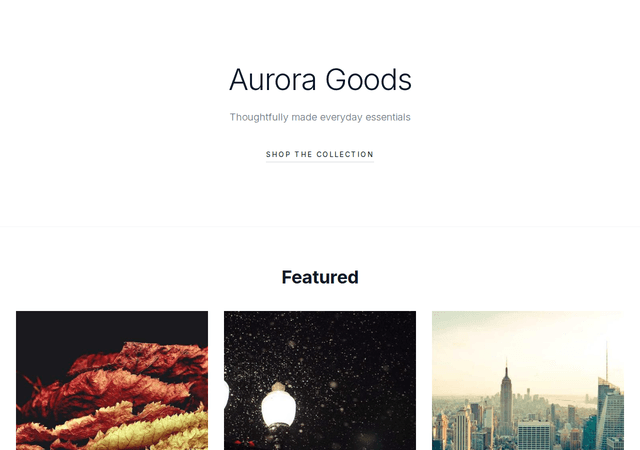
Here is the real home page of Aurora, one of our themes, written out:
| # | Block | Settings that matter |
|---|---|---|
| 1 | Hero | Minimal variant, headline from the store name, two buttons: "Shop the Collection" and "Our Story" |
| 2 | Product grid | Title "Featured", centred header, large editorial cards, 2–3 columns, 6 products |
| 3 | Feature rows | Heading "Made with intention", alternating layout |
| 4 | About preview | Story variant, the shop's own About text cut to 320 characters, an "Our Story" link |
Its theme settings are five colours (slate, near-black navy and an indigo accent on white) and Inter for both fonts. That's the whole theme.
How to build one, step by step
1. Start from the system, not a blank canvas. Look through the gallery and the block catalogue in our designer spec. Find the existing layout that comes closest to your idea. Ten of our 17 colour sets began as open-source themes from tweakcn, which uses the same colour roles as shadcn/ui. We map those roles onto ours automatically, and each one became a colour set of one of our themes. Work that only changes colours, fonts or spacing ships as a colour set of an existing theme; a new theme needs a different layout.
2. Set the theme settings. Choose the five brand colours, the 13 neutrals, two fonts and one value for each dial. Check contrast yourself, because several parts of a shop put white text straight onto primary, secondary or accent: the announcement bar, banners, most hero variants and the footer. So:
- each of those three colours needs at least 4.5:1 contrast against white;
- body text needs at least 4.5:1 against the background;
- primary needs at least 3:1 against the background, because prices and links use it.
Deeper shades work best: pale yellows and neon mints fall below these ratios.
3. Compose the pages. Build the home page from blocks, top to bottom. The catalogue, product and About pages usually use our shared defaults, but you can change them. If part of your idea goes beyond the blocks and their settings, you have two options. You can spec a new block or a new variant of an existing one; that's normal and welcome, and once it's built every shop can use it. Or you can drop that part. Everything is built from blocks, the theme's colours and the spacing scale, which is what keeps every shop fast and consistent.
4. Design the bad days, not just the hero shot. Real shops are messy, so design for:
- a 2-character shop name and a 50-character one;
- product names over 100 characters;
- missing photos, white packshots and transparent cut-outs side by side;
- sold-out, on-sale and enquiry-only products;
- an empty catalogue, and one with more than 12,000 products;
- a shop with no tagline, no About text and no reviews.
The home page still has to look finished.
5. Hand it over. Send design files (Figma is preferred, but any tool with inspectable frames works) at 390, 768 and 1440 pixels wide. Include:
- the theme settings;
- a contrast table;
- two or three recolours for very different shops, to show it holds up;
- a block map listing each section, the block it uses and its settings;
- specs for any new blocks;
- the licence for any decorative image you use;
- a name and a one-line description.
If you prefer HTML and CSS, send them as a visual reference. We translate them into theme settings and block settings. Every theme ships as settings, so there's no template code to maintain.
6. We build it and check it. Our team turns your files into a theme, so we write the file for you. Automated checks confirm that every block exists, every setting is allowed, every feature a block needs is switched on, the theme settings are valid, all four pages are there and there's a gallery thumbnail.
Then every theme must pass a bad-conditions test. It renders the theme at phone and desktop width with a random valid colour palette, only two products, missing photos and optional blocks left empty. It fails the theme if:
- the page scrolls sideways;
- placeholder text or a broken image shows;
- a band or box is left blank;
- a contact or newsletter block gives shoppers nothing to act on;
- a product card has neither a name nor a photo.
After that, we apply the theme to a demo shop with realistic, messy products and send you private preview links for phone and desktop. One round of fixes is part of the process.
7. It goes into the gallery. The gallery shows a shop owner your thumbnail, a five-colour swatch, the heading font, the first few home-page sections, your one-line description and an Apply button.
What happens after a shop applies it
Applying a theme copies its pages and theme settings into that shop, and records which theme and which version it came from. The shop's previous theme is saved first, so it can be restored in one click. From then on the owner can change anything, and every change saves the previous state.
That means each shop keeps the version it applied, and a later update to your theme goes to the shops that apply it from then on. A fix, such as a contrast failure or a typo in default copy, is edited in place. A visibly different layout becomes a new theme. If a theme is retired from the gallery, shops that use it keep their copy.
How that compares
This table covers the template maker's side on each platform. The outside figures come from each platform's own pages, read on 1–2 October 2026. The links are below the table.
| What you hand in | Tools | Review | How updates reach shops | What the maker keeps | |
|---|---|---|---|---|---|
| btab | Design files, theme settings and a block map. The btab team turns them into a theme | Any design tool, plus our spec and block catalogue | Design review, automated checks, the bad-conditions test, a demo-shop preview and one fix round | Each shop keeps the copy it applied; updates go to new applies | Talk to us at [email protected] |
| Shopify | Theme code (Liquid, sections, blocks) and a settings file, started from Shopify's Skeleton starter [1] | Shopify CLI, Theme Check, a development store [1] | Five-stage review. Lighthouse averages of at least 60 for performance and 90 for accessibility [2] | Automatic only if the merchant changed nothing but settings and JSON templates; otherwise an unpublished copy [3] | 85% (Shopify keeps 15% of gross) [4] |
| WordPress / WooCommerce | A block theme: theme.json, HTML templates and PHP patterns [5] | Create Block Theme plugin, Theme Check [6] | WordPress.org: free GPL themes only, reviewed by volunteers with no set timeframe [7]. Woo Marketplace: automated tests, then business, code and design reviews [8] | Theme files update, but the owner's Site Editor changes are stored in the database and win [9] | WordPress.org: free. Woo Marketplace: 70% of net [10] |
| Webflow | A finished site, including a required style-guide page [11] | Webflow, plus the Figma to Webflow plugin [12] | Approved creators only. A scored rubric, typically 3–5 days [11] | None. Source edits reach later installs only [13] | 95% [14] |
| Framer | A finished project that buyers remix [15] | Framer, plus a Figma plugin [16] | No manual review. Since 16 June 2026, listings are moderated by reports [17] | A remix is an exact copy, so edits reach later remixes only [15] | 100%. Framer takes 0%, and the maker sells through their own checkout [18] |
| Wix Studio | A finished Studio site [19] | Studio Editor, plus the Figma to Wix Studio plugin [20] | Wix Partners only. Up to two rounds, aiming for a result within 60 business days [19] | None for sites already using it. After approval only listing details can change, and a new layout means a new template [21] | 100% of net [22] |
| Squarespace | No marketplace: "it's not possible for third-party designers to sell templates" [23] | — | — | — | — |
Sources, all read 1–2 October 2026:
- Shopify, Create a theme and Shopify CLI for themes
- Shopify, Theme Store requirements and Submit your theme
- Shopify, Updating your theme
- Shopify, Revenue share
- WordPress, Theme structure and Introduction to theme.json
- WordPress, Create Block Theme and Theme Check
- WordPress Themes Team, Review process and Required
- WooCommerce, Submitting your product
- WordPress, Introduction to templates and Style variations
- WooCommerce, Vendor agreement
- Webflow, Submission guidelines, Grading rubric and Contribute to the Marketplace
- Webflow, Figma to Webflow plugin and app
- Webflow, Submit a template
- Webflow, Template applications
- Framer, How to publish a template
- Framer, Importing from Figma and the web
- Framer, Template best practices and the new Framer community
- Framer, Creators and How refunds work
- Wix, Template submission guidelines
- Wix, Figma to Wix Studio
- Wix, Selling your Studio templates in the Marketplace
- Wix, Marketplace terms and Selling templates in the Marketplace
- Squarespace, Understanding Squarespace templates
What the table shows. The code platforms (Shopify, WordPress) give you full control, and you pay for it in upkeep, because every update has to work around whatever owners changed. The visual builders (Webflow, Framer, Wix) skip the code, but a template is a one-time copy of a finished site. btab sits between the two. You hand in a design, not code, and you design within a shared system of blocks and theme settings. Every theme is drawn by the same storefront code, so improvements to that code, such as better image handling, reach every shop.
How to start
Want to build a theme for btab? Email [email protected] with a link to your work.
Start with the home page at phone and desktop width.